Some Kanji characters are written slightly differently in the Mincho/Gothic typefaces or handwriting. Ones that come to mind are 令、心, and these have been discussed before [1]. This font-dependent variation is consistent when the character occurs as a sub-element of another character (e.g. as in 冷).
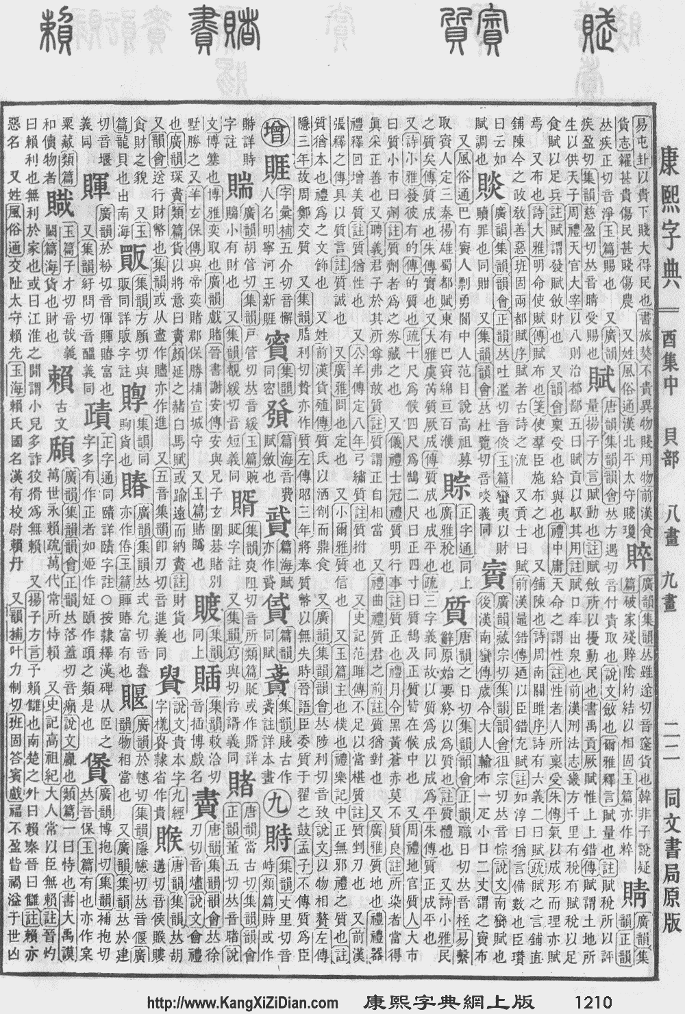
Today, I encountered the character 賭 (as in 賭け, 賭博) that looks like it's consists of the sub-elements 貝 and 者. Interestingly, the Mincho font on my machine puts one extra stroke on the top right of the 日 on the right hand side.
I was puzzled because the character 者 by itself doesn't show this variation. Thoughts?
[1] Why are there two versions of the kanji for 冷?
Answer
In fact, the 者 character has the dot in the Kangxi dictionary. This variant is coded in Unicode as 者 and is etymologically the older one.
It is worth pointing out that 賭 was only added to the Jōyō kanji list in 2010. Computer fonts usually use traditional (= Kangxi) shapes for characters not on the list; cf Asahi characters and extended shinjitai. Curiously, if you look at the official list, they explicitly say (p. 3) that this variation is permitted for 賭:
付 情報機器に搭載されている印刷文字字体の関係で、本表の通用字体とは異なる字体(通用字体の「頰・賭・剝」に対する「頬・賭・剥」など)を使用することは差し支えない。
See also p. 9.
No comments:
Post a Comment